Webex Teams Mobile App On-boarding
Role
Fei Huang Lead Product Designer (Activation 0→1)
Sara Border UX Writer
Alex Rosandick User Journey Analysis
Alexis Faraut Illustratior
Responsibility
Redesign on-boarding for Webex Team on mobile (iOS and Andriod). The redesign includes concept ideation, UX flows, visual design, illustration, prototyping, and working with developers for quality assurance.
Problems
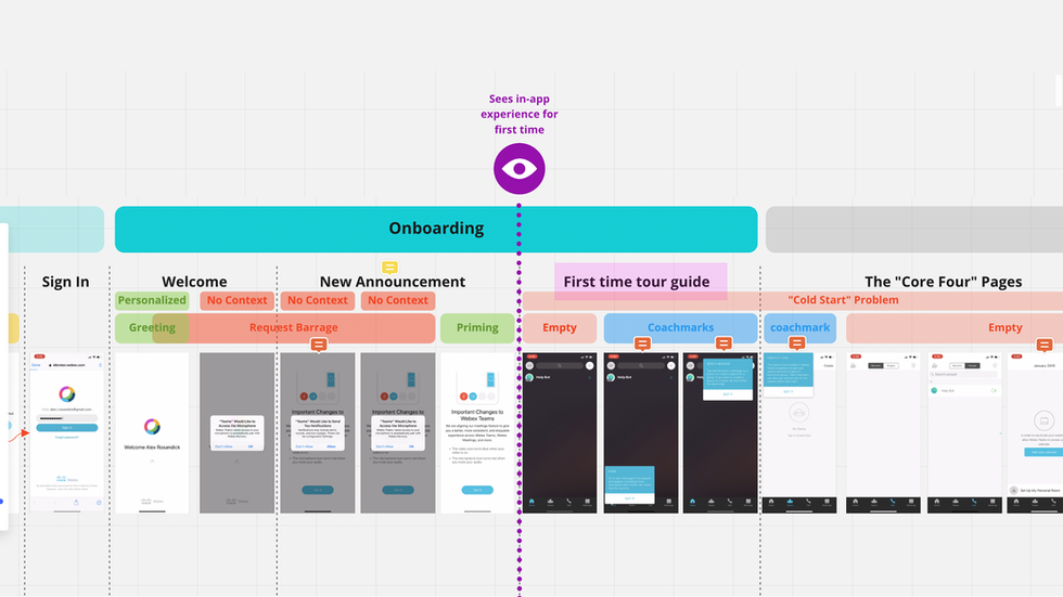
1. Poor first impression: plain visuals, robotic and unwelcoming voice/tone, lacking brand personality.
2. Previous freestyle exploring leads to a knowledge gap, it's long-winded and consists of unnecessary information, offering little help on product stickiness and user retention on the mobile platform.

Solution 1 - create delightful and relatable contents
Three major illustration scenes are crafted for a quick overview of the Teams mobile app. Natural and helpful mini conversations are used to create a pleasant on-boarding experience that helps prevent users from dropping off after signup.
Solution 2 - design "on-the-go" scenarios
The tour center gives users quick access to tours that demonstrate how they can collaborate with others quickly and efficiently.
Research shows that users who send Teams messages on day 1 (of using the product) are most likely to stay with the app on day 30. Based on the research, create two well structured short tours —"Contact a Person" and "Create a Space" to encourage users to send messages.


