
Visual Infrastructure
Design System Foundations for Meta Business Products
Role
Fei Huang Visual System Lead (Cross-org alignment)
Trace Byrd Art Director
Emily Yao User Researcher
Project Overview
Geo 2.0 was a system-level initiative to evolve the visual foundations of Geodesic (Geo), Meta’s design system for business products, including Ads Manager and Meta Business Suite.
The goal was to improve clarity, trust, and brand alignment across complex, data-dense surfaces used by millions of advertisers.
The work focused on redefining visual primitives: color, typography, and hierarchy, so they could scale reliably across revenue-critical product surfaces while aligning with Meta’s Company Design System (CDS).
Responsibilities
-
Established the visual infrastructure that enabled multiple product teams to build high-density workflows consistently across Meta Ads Manager and Meta Business Suite.
-
Led the visual system strategy for Geo 2.0, aligning Geo with Meta’s Company Design System while preserving the needs of data-dense business tools.
-
Defined updated visual primitives (color, typography, hierarchy) that improved clarity and trust across complex analytical interfaces.
-
Partnered with engineering, research, and product teams to validate, ship, and drive adoption across Ads Manager and Meta Business Suite.
Problems
Geo 1.0 components had scaled across many product surfaces, but the underlying visual primitives had not evolved with them.
As a result:
• hierarchy and semantic color could no longer reliably signal priority
• spacing and typography behaved inconsistently across workflows
• dense analytical interfaces became visually flat and harder to scan
At the same time, Geo had diverged visually from Meta’s Company Design System (CDS), creating inconsistencies in shared primitives and brand expression.
The system needed stronger visual foundations to support clarity, trust, and scalability.
Addressing these issues required both strengthening Geo’s visual foundations and clarifying its relationship with Meta’s Company Design System.

Before: Surface-level divergence under Geo 1.0

Visual Direction
Three visual directions were explored and tested with small and medium-sized business users.
The direction aligned with Meta’s Company Design System (CDS) performed best, combining stronger brand alignment with improved clarity in dense workflows.
This led to a strategic decision:
CDS would continue serving consumer products, while Geo evolved to support the more complex, data-dense needs of business tools — while sharing visual primitives where possible.
CDS vs Geo comparison
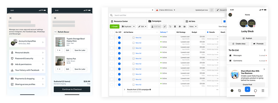
- Consumer Products in CDS -
- Business Products in Geo 1.0 -
3 Tested Brand Directions

- Existing Geo Style -
- Geo Style Aligned with CDS -
- Geo Independent Style -
Inspired by Meta brand reflected in marketing like Meta.business.com
System Evolution
Geo 2.0 focused on strengthening the system’s foundational layers:
• Color tokens aligned with CDS while expanding expressive range for analytical states
• Typography hierarchy optimized for dense tables and small-scale data surfaces
• Spacing and layout primitives refined to support clearer information hierarchy
These changes improved readability and consistency across high-traffic workflows.
System-Wide Adoption & Validation
The refresh was rolled out progressively across Meta Business Suite and Ads Manager.
High-traffic but lower-risk surfaces were validated before expanding to more sensitive workflows.
User research and internal metrics showed improvements in visual clarity, trust, and system adoption.
Impact
• Increased design system adoption across product teams
• Reduced component overrides as visual primitives became more reliable
• Improved visual clarity and trust in key advertiser workflows
Teams began treating Geo as an enabling system rather than a constraint.
Geo 2.0 established the visual foundations that later enabled more advanced system work, including the data visualization and decision frameworks explored in the following case study.