Webex Meetings UX/UI Refresh
Role
Fei Huang / UX & visual design
Xinran Lu / UX design
Marve Svenningsen / icon design
Responsibility
Create visual design specs, make design decisions on typography, color choices, graphic patterns, and iconography usage to modernize the look of the Windows/Mac desktop clients, and optimize the user experiences.
Problems
1. Difficult for users to navigate through tasks since the buttons and toggles are scattered in the interface.
2. The interface is visually outdated
Solutions
1. Simplify the user experience by surfacing the frequently used functionalities.
2. Create a modern look to excite and engage users, makes Webex stand out among the competitors.

Solution 1 - surface frequently used functionalities
The library is built in Figma and open to all the design teams within the organization. It includes 4 sessions:
Read me give users an overview of the guidance for quick scans
The tips and tricks provide cheat sheets for hands-on tasks
Requests & review process direct designers on how to start an illustration request. It also gives an overview of the review process to set up the expectation
Sticker sheets contain ready to use assets and mockups to provide context
Improved typography
Typeface choice
MAC and Windows system typefaces are replaced by CiscoSans. It gives WebEx a unique, modern, sophisticated and professional look and feel.
Font weight and size
CiscoSans extra light, light, regular and bold are used in deferent sizes to build information hierarchy and help users read through the content.

New design: people list view with meeting info
Font color
Information hierarchy is also created by applying different shades of greys on the text. Use blue text to highlight functionalities that are turned on or indicate elements are actionable.
Whitespace
Removed a grey bar at the bottom to increase whitespace. The whitespace guides users eye through the layout and creates feelings of order and sophistication.
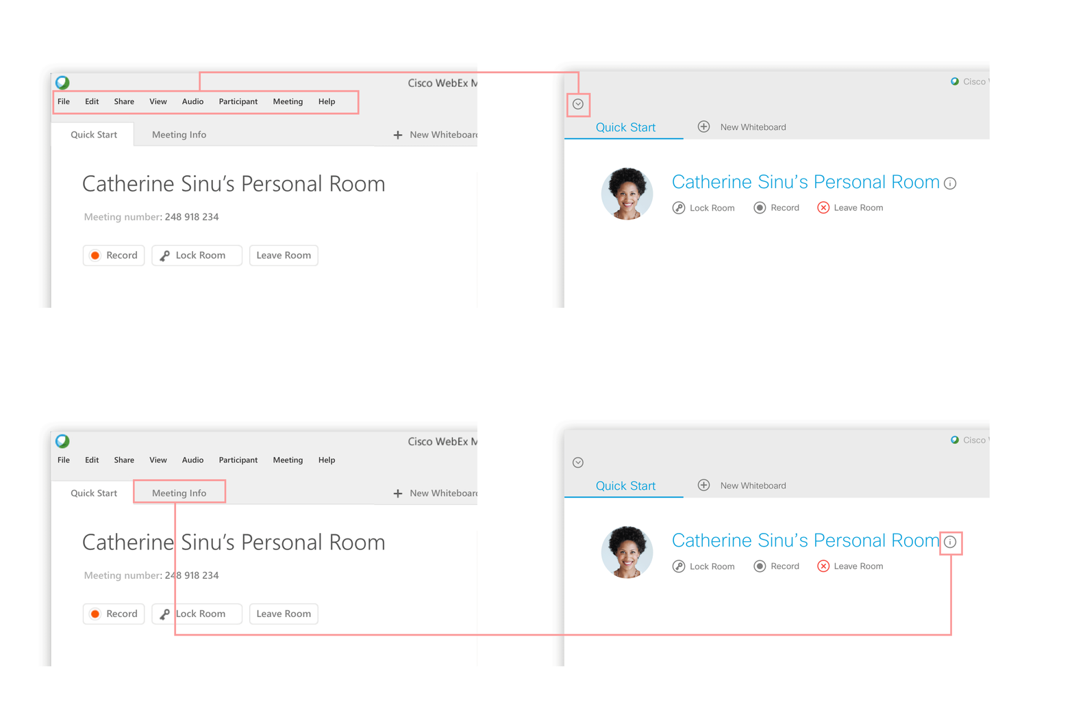
New and improved icons
In order to increase content readability, gradient icons are replaced by flat and slim icons. Icons are also used to hide less frequently used functionalities and distinguish content layers.
Old design
New design


Intuitive controls in quick start
Three dots icons are removed and replaced by words to avoid confusion.

Old design

New design
Improved video thumbnail view

Add animated sound wave icons on name tag to create a consistent experience between people list view and video thumbnail view. Create contact card to surface frequently used functionalities. Remove grey silhouettes, create text and image avatars to represent participants who turned off their videos.

New design
Improved full screen mode
In order to encourage participants to turn on videos. Video layout is also optimized in full screen mode. Active speaker video is enlarged. Contact cards can also be accessed here.

